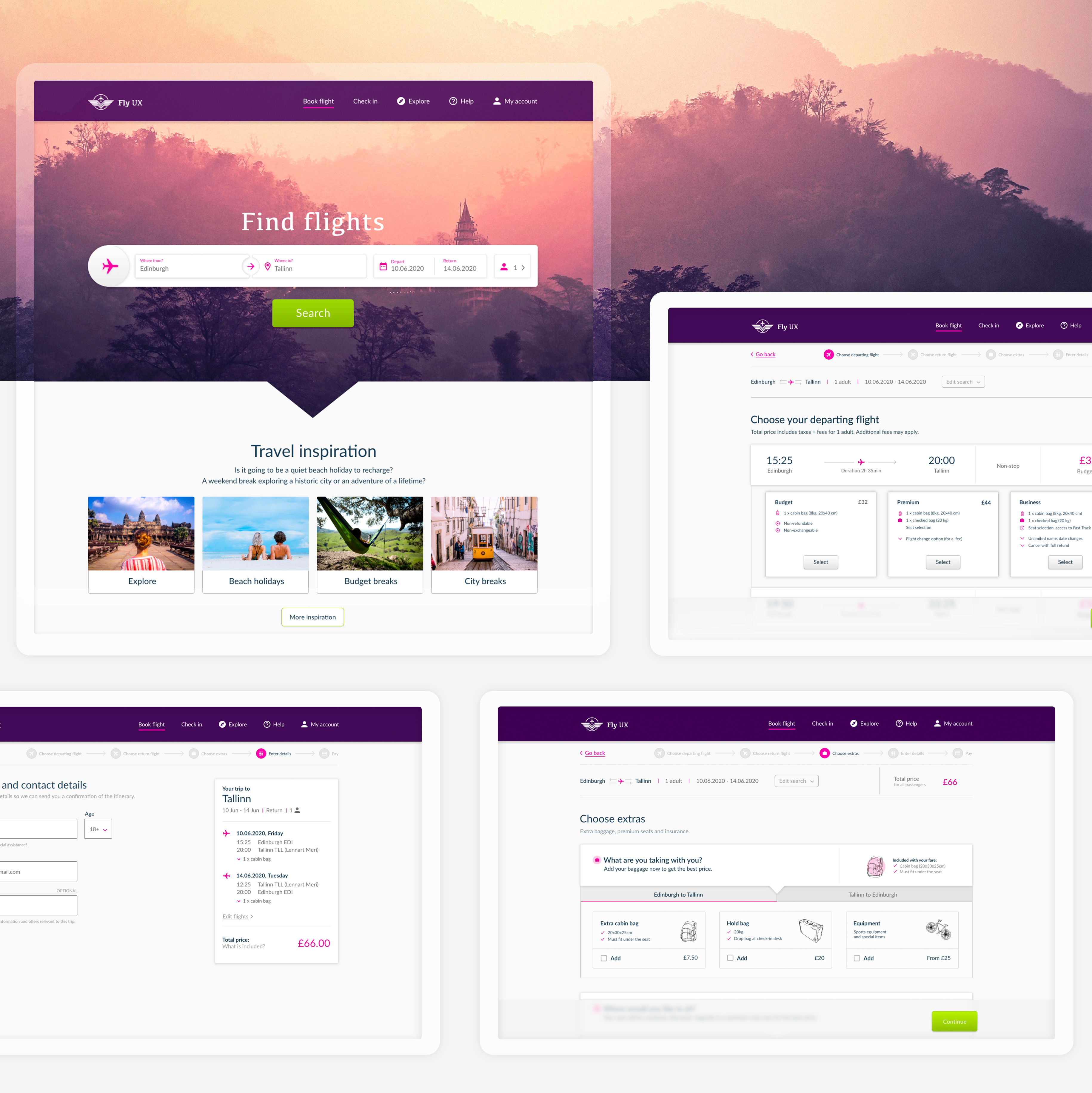
Flight booking process UX case study

This is a case study I created that demonstrates my UX process for an airline website. Done as a part of the UX Design course with the UX Design Institute.

Fly UX is an airline company that provides a quick and easy flight booking service with competitive prices for a range of budgets. Its simple mission is to make booking flights as exciting as exploring new destinations.

The project: Flight booking process for the UX Design Institute professional diploma course.

Tools: Adobe XD

01 Research

Identifying the problem

Why is booking a flight is so frustrating? 

Nothing beats planning a holiday on a cold winter day, planning your next trip to the sun gives you something to look forward to but the experience of booking a flight can be extremely negative. It can leave you feeling very frustrating, rushed, overwhelmed with information and bombarded with pop ups. You might even start questioning your decision to go on holiday as a result.

I used varied research methods to better understand the problem and pinpoint what frustrates users the most about the flight booking process. My main goal was to maintain and even increase the excitement generated by an upcoming trip throughout the booking process

Objectives

  • Identify high-level flow issues on airline websites and find out about the industry conventions
  • Conduct usability tests to identify user challenges and learn more about user goals

Methods:

In-depth interviews / Usability tests / Competitor benchmarking / Heuristic evaluation / Online survey
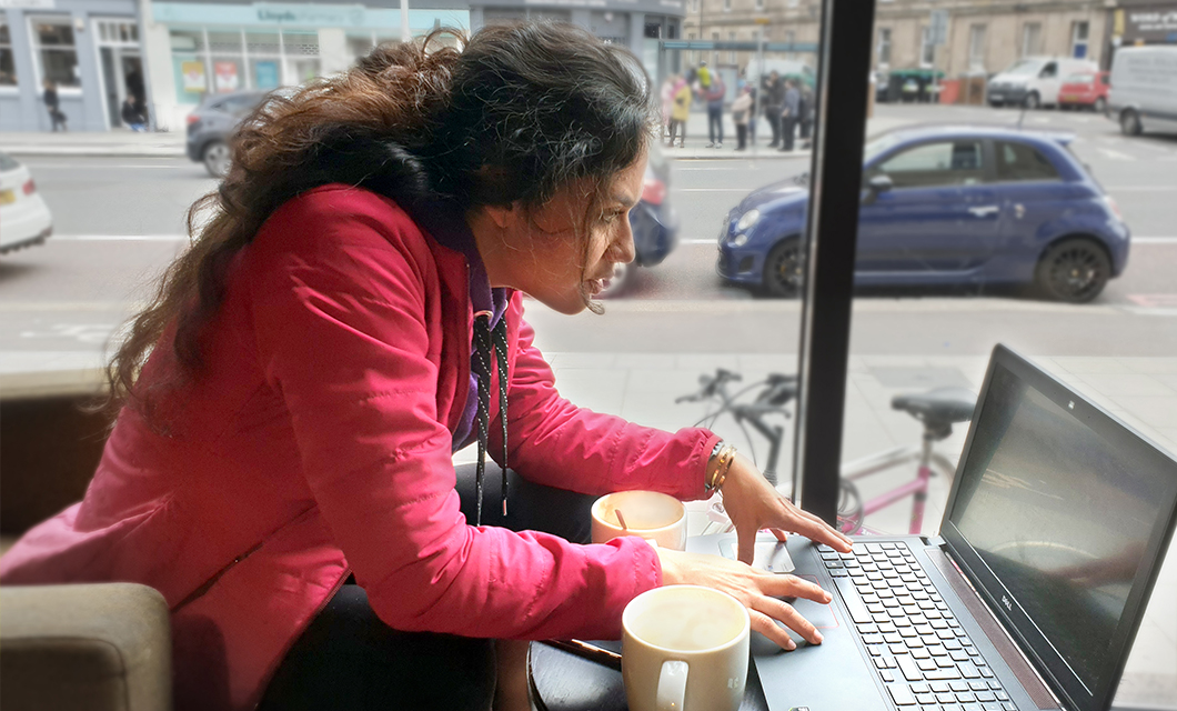
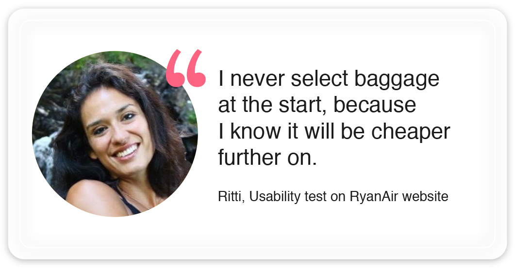
Usability tests and in-depth interviews

I conducted usability sessions and in-depth interviews with 5 users to learn more about their goals, behaviours and pain points.

The best way to find out usability information about your product and the quality of user experience is to observe people using it

Online survey

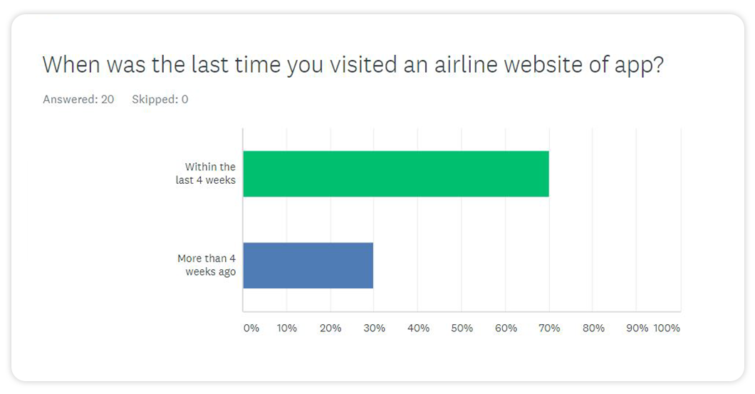
I asked 20 people about their booking habits and behaviours. I gathered both qualitative and quantitative data which helped me prove some of the assumptions to be true.
Competitor benchmarking

I compared booking processes on 5 websites and used heuristics principles to evaluate areas that could be improved and  industry conventions.
Research findings and observations

Most of the evidence suggests that there is a huge trust issue. People expect to be tricked into paying more money for everything. so for the majority of people booking a flight is stressful. A simplified process which doesn’t require too much effort would be appreciated by them.

Can’t be trusted

People feel like they will be charged for every little thing

Desktop

Research may be done on mobile, but majority prefer to book on desktop

More than one visit

It takes more than one visit to the site for 85% of people to book a flight

02 Analyse

Understanding the problem

The unstructured data I gathered during the research had to be analyzed to help articulate the problems that need to be solved. I used different techniques to define visible patterns in the unstructured research data. Analysis helped me transform raw data into valuable insights and conclusions.

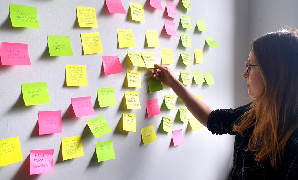
After I finished gathering the data, I went back and read the summaries of interviews, online survey results, watched usability tests and reviewed competitor benchmarking.  I wrote down all the relevant information on post-it notes and made an affinity diagram.

Strategy

User needs: Provide quick and easy flight booking service
Product objectives: Increase sales and customer satisfaction

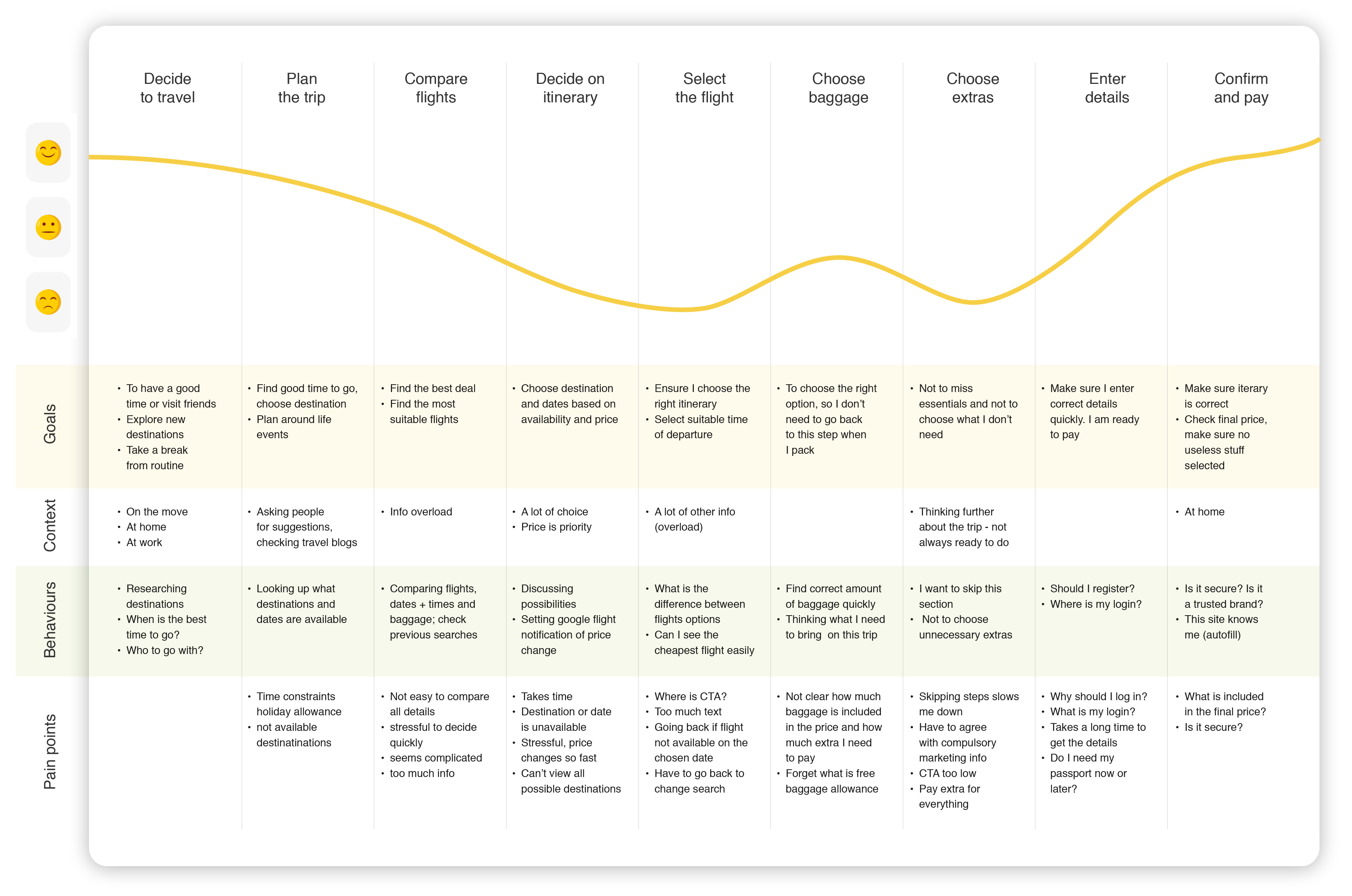
User journey

I combined all the research findings and used this technique to map out the user journey. It helped me to see how user goals, behaviors, context and pain points change along each step of the way.

Affinity diagram

I used an affinity diagram to structure gathered data. Grouping vast amounts of information helped me to identify meaningful patterns and draw conclusions.

What is working?

  • Auto-fill forms + memorising destinations
  • Feels like the site knows me
  • Low price comparison (like Skyscanner)

What isn’t working?

  • Too many irrelevant steps in the process, it makes users think too much
  • Users need to be really careful not to select something they don’t need
  • People change their mind and take long to make their decision (site doesn’t support it: hard to go back, everything resets, session times out)

Conclusions

Most people don’t trust airline companies, they find the whole process of booking stressful and feel like it requires a lot of effort. They expect to be tricked into getting something they don’t need and use incognito mode, because the price will go up when they return to book the flight.

Themes that come up the most are: planning the trip, user behavior, price, information overload, trust, how easy is it to find info, speed of booking and what happens when things go wrong

Trust

People expect to be tricked, so they have to stay alert during the whole process which makes booking stressful.

Fear

People are afraid the price will increase and use incognito mode to check it before booking.

Overload

Too much information and the lack of visual hierarchy causes cognitive overload which can result in stress.

03 Design

Solving the problem

In the design stage my objective is to fix the issues identified in the previous stage and highlighted by the affinity diagram and customer journey map.

I started with high-level flow, focusing on a primary use case. After that I sketched up the navigation and interaction in more detail and only then I moved on high-fidelity prototyping in Adobe XD.

Methods:

Top level user flow/navigation and interaction sketches/prototyping/wireframing

High-level flow, focused on one primary use case

Interaction and navigation design sketches

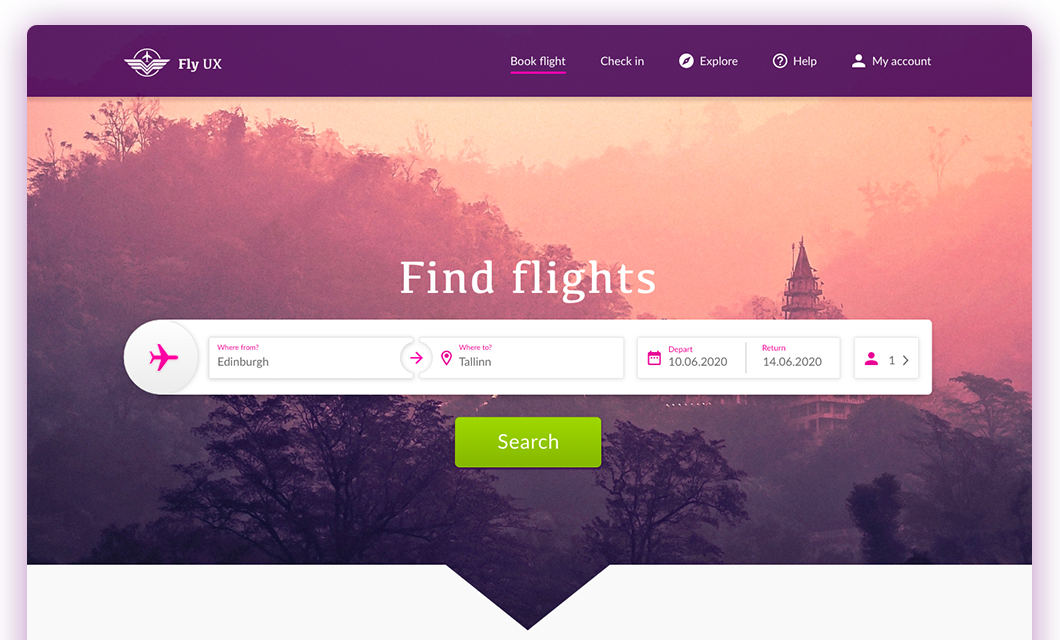
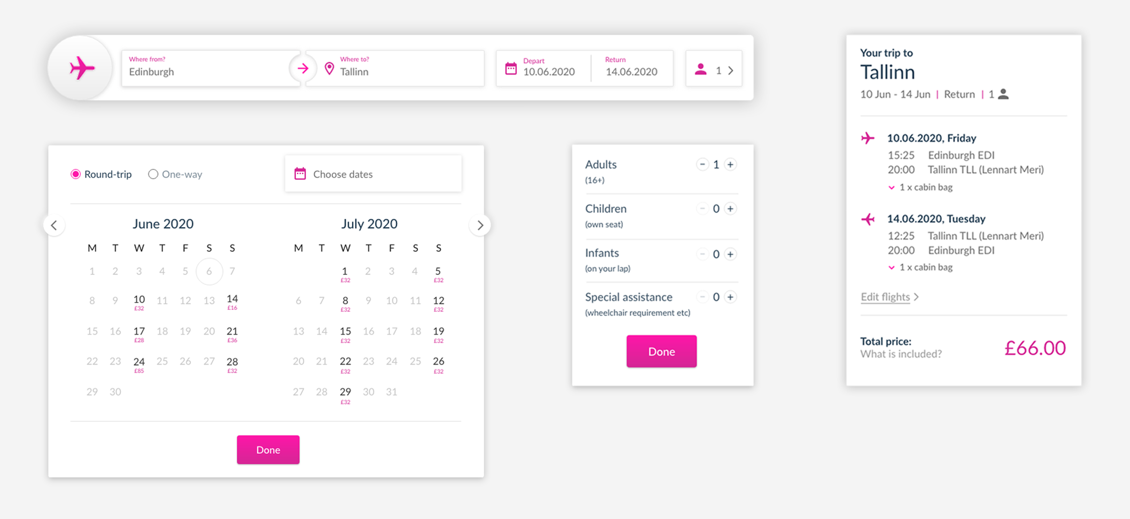
High-fidelity prototype